Key Elements to a Fantastic Logo
Every good brand starts with an unforgettable logo.
If you don’t already have a logo for your business, it’s about time to get one. A good logo is the centerpiece of your business identity. The more recognizable that your logo is, the stronger authority it will hold among your customers. So, before you have your closest family member sit down with their crayola’s and design your first concepts of your logo, there are a few things to consider. These are the key elements that every good logo should have.
Variety Matters
You’re logo isn’t a one size fit’s all. Remember you are going to be using it EVERYWHERE! On business cards, your website, vehicles, maybe even billboards! In order for your logo to maintain it’s power across multiple venues, you are going to need variations. Usually, a square, horizontal, and vertical version of your logo will suffice for your the variety of destinations where it may potentially be placed.

Super-Sized
When creating your logo, think of size. Consider if your logo will still be recognizable if it’s the size of a thumbnail or on the side of a semi-truck. Even if you are a small business, it’s important to create a logo that is adjustable because you never know where you will want to use it in the future.
Keepin’ it simple
The real challenge of a logo is capturing the overall feeling and presence of a business in a simple and easily digestible logo. In a snap instant of seeing your logo, your customer should get a sense for what your business is all about. Basic lines, and simple shapes and fonts always produce great results. The more gradients and layers that are used in your logo, the more difficult it will be to maintain it’s quality on specific material. Not sure if your logo is too complex? Try the embroidery test. Many employees often want to purchase clothing with an embroidery of their business logo. So test it out on one shirt. If is comes back and the logo is still intact and easily identifiable, then you’re good to go!
Color Choices
It is important to know how people perceive different colors before you choose yours. For instance, if you are a dentist or medical office, it’s probably wise to steer clear of red because your audience might associate that with blood. The Logo Company put together this helpful color guide that explains how color induces different feelings and emotions in your customers.
Secondly, choose a color that is in the same gamut for digital and print objectives. Different devices have different gamut ranges. Your computer for instance uses RGB, while your printer only prints in CMYK. Remember for branding purposes, your logo should be easily identifiable and this means that COLOR MATTERS! Don’t choose a bright buttery yellow on your computer that is out of the printing gamut and turns out a deep orange when printed. Make sure all of the colors you choose when designing your logo on your computer can be correctly converted into CMYK for professional print material.
Legibility
Any text in your logo should be as clean and crisp as possible. We always refer to the “Highway Test.” If your logo was printed on the side of a vehicle driving at 40 mph down the highway, would a person be able to read the text? In order to pass this test, make sure any text in your logo is clear, without drop shadows or other effects. Don’t leave your customers scratching their heads trying to understand your logo!
Mark It
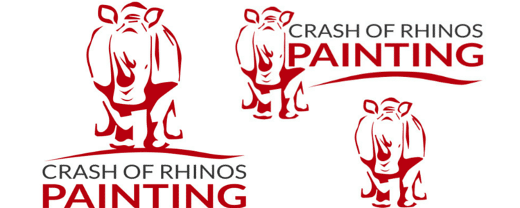
Use an identifying symbol to mark in every version of your brand. There might be circumstances when you cannot include text, just the symbol. It can be a part of your business name, or an image the signifies your business. For example, Crash of Rhinos Painting uses an outline of a Rhino for their identifying symbol. Now, when their customer’s see that symbol, they associate it with Crash of Rhinos Painting, even without the business name present.
Take out the Color
You might need to periodically print your logo without color. Before you do your final logo selection, desaturate the image and inspect it’s quality. Try printing in various sizes and make sure they are up to your standards. Most of the time your logo will be bright and colorful, but just to cover your bases, test it out in black and white as well.
![]()
Where to start?
If you are thinking about tackling your logo yourself, make sure you have some serious design talent, and the use of Photoshop. If you’re doubting your logo design skills or just don’t have the time or patience to create one yourself, we can definitely help! We’ve done many logo designs and have the experience to create you an awesome one! Give us a call today and we can help get you started.